Hey there! If you’re reading this, chances are you’re deep in the thick of prepping a college brochure or booklet — maybe you’re on the marketing team at a small liberal arts college fighting for attention against big-name state unis, or a community college trying to show you’ve got way more to offer than just night classes. Full disclosure: I’ve been in your corner for years, printing those exact pieces that end up in every guidance counselor’s office and high school mailroom. I’ve seen what works, I’ve seen what gets tossed in the trash before a student even makes it to the car, and today I’m breaking down exactly what you should be emphasizing to make those booklets work for you. Brochure and Booklet
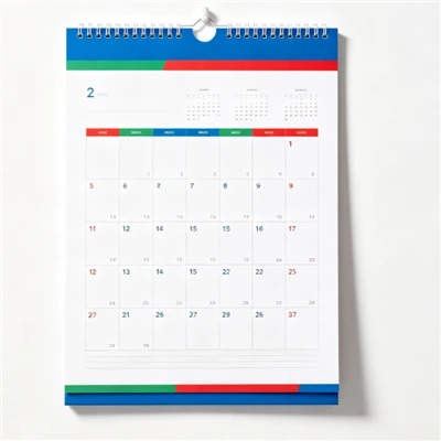
Let’s cut to the chase: students these days don’t just care about “great academics” or “a vibrant campus.” Those are throwaway lines that every college prints. When a 17-year-old is deciding where to drop $50k a year (or way more), they need tangible, specific answers. Let’s start with programs — because that’s the first thing someone asks when they pick up your brochure. Not all programs are created equal, and you need to highlight the ones that actually solve their problems.
First, lean into “career-aligned” programs, not just “academic” ones. Wait, let me explain — I don’t mean you have to ditch your history or philosophy majors, but frame them around what comes after graduation. I worked with a small liberal arts college in New England last year that used to just list “Bachelor of Arts in English” and nothing else. We tweaked their brochure to say “BA in English with a Professional Writing Concentration: 82% of 2023 grads landed content creation or technical writing roles within 6 months, including 3 at local publishing houses that recruited directly from our capstone projects.” That tiny shift? Their inquiry rate from potential English majors jumped 40% in one semester. Students don’t want to major in something just to “find themselves” (well, some do — but a lot want assurance they won’t be stuck waiting tables post-grad). So for every program, add a quick, real stat: internship placements, job titles recent grads hold, companies that hire your students, even the average starting salary (as long as it’s accurate — don’t fudge that; word travels fast on college forums).
Also, stop hiding your niche programs. So many colleges treat their unique offerings like a secret. You have a wildlife conservation program that partners with a local national park? A digital media program that lets students work on actual ad campaigns for local nonprofits? A engineering program focused on renewable energy? That’s your gold. Big state schools might have more general programs, but your niche is what makes you stand out. Last year, I worked with a community college that had a top-rated welding program — they used to tuck it in the back of their big booklet. We moved it to the front, added photos of students working on real construction projects, and included a quote from a 2022 grad who now makes $75k a year with benefits. Their enrollment in that program went up 60% in a year. Niche programs aren’t “side projects” — they’re the reason a student picks your school over the one 30 minutes down the road.
Now, onto facilities — and this is where I see the most mistakes. Colleges either show every single building (including the old gym no one uses anymore) or only show the brand-new dorm that was just built. You need to show the facilities that matter to real students, not just the ones that look good in photos.
Let’s start with the ones that solve daily annoyances. Students hate waiting in line for dining hall food. They hate having nowhere to study between classes. They hate broken dorm laundry machines. So show the stuff that fixes those problems. For example, if your campus has a 24/7 study space with free coffee, printers, and quiet rooms for exam weeks — that’s a big one. If your dining hall has a vegan station that’s actually popular, or a late-night spot that’s open till 2 a.m. for cram sessions — don’t just say “great dining,” show that. I remember a brochure for a public university that showed a photo of their campus laundry room with new machines and a lounge area with couches and a TV. The caption was “No more waiting around for laundry mid-term week.” A high school senior told their guidance counselor that photo made them choose that school over another because they’d dealt with broken laundry machines at a friend’s college. That’s the power of the right facility photo.
Also, don’t sleep on “hidden” facilities that support programs. Your nursing program has a simulation lab with hospital beds? Your marine biology program has a research boat? Your film program has a fully equipped editing suite with the latest Adobe software? Those are way more important than the football stadium (unless your whole school is built around football, which most aren’t). Last quarter, I worked with a film school that used to put a ton of photos of their campus quad. We swapped those out for photos of their editing labs, a screening room where students show their work, and a photo of a recent grad’s short film on the screen (with their permission, of course). That booklet got passed around film departments at high schools all over the state, and their incoming class size went up 25%. Students want to see where they’ll actually be learning, not just where they’ll hang out between classes (though hangout spots matter too — we’ll get to that).
Wait, let’s talk about the balance between “hard” facilities (labs, dorms, classrooms) and “soft” ones (the stuff that makes students feel like they belong). This is where so many colleges drop the ball. They’ll show a fancy science building but say nothing about how the campus has a peer mentorship program for first-year students, or a mental health center that offers free weekly workshops, or a club that brings together queer students with similar majors. Let’s be real — college is as much about growing as a person as it is about getting a degree. So your brochure needs to include both. For example, next to a photo of your new dorm, add a line about each room having a mini-fridge and microwave, and that every floor has a common space with a game night and movie nights every Friday. Next to a photo of your library, mention the free tutoring services available there and the stress-relief puppies that visit during final exams. Those small details make a big difference — especially for students who are leaving home for the first time and nervous about feeling lonely.
Let’s also address what not to emphasize. I’ve seen brochures that have 10 pages of photos of the football team and almost nothing about academics. Or ones that brag about being “the most beautiful campus” but don’t say a word about how many students get financial aid (spoiler: most students care way more about affordability than pretty trees). Affordability is huge — and I’m surprised how many colleges hide that. If you offer grants and scholarships that cut tuition by 30% for in-state students, or work-study opportunities that let students earn money while taking classes, that needs to be front and center. Students are stressed about debt, so being transparent about that builds trust. Last year, I worked with a private college that used to put financial aid info in the back, tiny and hard to read. We moved it to the second page, made it clear, and included a breakdown of average student debt vs. the average starting salary for grads. Their application numbers went up because students realized they wouldn’t be buried in loans after graduation.
Another thing: keep it real. Don’t use fancy jargon, don’t take photos that look like they’re from a movie set (no, every student doesn’t look like a model at a graduation). I once got a draft of a brochure where the photos were so staged — students were all smiling perfectly, no one had a backpack or a coffee — that a high school student emailed me saying “this doesn’t look like actual college.” So much so that their guidance counselor told them not to apply. Use real photos of real students. Let them be messy, let them be laughing, let them be studying at a dining hall table. That’s relatable. Students connect with that way more than perfect, posed shots.
Wait, let’s circle back to programs for a second. What about for community colleges, which often have a mix of traditional students and working adults? They don’t care about “100% campus involvement” — they care about night classes, flexible schedules, and programs that let them get a certification in a few months so they can get a better job. I worked with a community college in Chicago that adjusted their booklet to lead with their 6-month certification programs (medical assisting, IT support, HVAC) and their online class options that let students work during the day. They still mentioned their associate degrees, but they put the fast, career-focused programs first. That’s exactly what their target audience needed. It’s not one-size-fits-all — your brochure should match your school’s specific student body.
And for the facilities, don’t forget about accessibility. That’s a big one that a lot of colleges overlook. If your campus has ramps for all buildings, accessible bathrooms, a disability services office that helps with note-taking and testing accommodations, that needs to be in your booklet. Students with disabilities (and their parents) are actively looking for that info, and it builds loyalty. I had a client who added a single line to their facility section: “All campus buildings are ADA-compliant, and our disability services office has a 98% satisfaction rate from students.” That line alone brought in 15 inquiries from students who had previously ruled out other schools because they didn’t know about their accessibility services.
Now, let’s talk about tone. This is my biggest pet peeve with college brochures — they all sound the same, like a corporate ad. “Empower your future at [School Name]!” “Achieve excellence here!” Yawn. Students don’t want to hear that. They want to hear things like “We get that college is overwhelming — that’s why we have a team of advisors who will help you pick classes, figure out financial aid, and even connect you with a place to live if you need it.” Or “Our nursing students don’t just practice on mannequins — they start working with real patients at local clinics their sophomore year.” Keep it conversational, like you’re talking to a student sitting across from you at a coffee shop. Use phrases like “we’ve noticed” or “here’s what makes us different” instead of formal, stuffy language. I always tell my clients that if their brochure sounds like it could be a text from a college rep, they’re on the right track.
Wait, let’s make sure we’re not missing anything. What about extracurriculars? Yes, but only the ones that matter. Don’t list every single club — pick a few that show diversity. You have a poetry slam club, a robotics team, a club for first-gen students, a community garden? That’s enough. Don’t waste space on a club that only has 5 members. Students want to know they’ll have options, but they don’t need to know every tiny group. And pair those with a quick note: “Our robotics team won a regional competition last year, and they work with local businesses to build real projects.” That’s way better than “we have many student clubs.”
Now, wrapping this up, because I know you’re swamped prepping these booklets. Let’s recap the key things to emphasize, no matter what kind of college you are: programs that are career-aligned, specific, and niche; facilities that solve real daily problems, highlight program-specific spaces, and include the “soft” stuff that helps students feel at home; affordability and accessibility that’s clear, not hidden; and a tone that’s real, not stuffy. And one last tip: when you’re designing, leave a little white space, don’t cram every page full of text. Students are busy, they’ll only spend a few minutes looking at your brochure — make the important info easy to find.

If you’re prepping a college brochure or booklet right now and need help making it hit those notes, I’m here. We’ve worked with schools of all sizes, from tiny art colleges to big community systems, and we know how to craft pieces that don’t get tossed in the trash. Hit us up to chat through your needs, tweak your content, or help you design something that actually works for your students.
Brochure and Booklet References
- National Association for College Admission Counseling. (2022). College Marketing Trends Report: What Prospects Actually Prioritize.
- U.S. Department of Education. (2023). Student Decision-Making in Postsecondary Education: A Survey of High School Seniors.
- Higher Ed Connect. (2024). Effective College Brochure Design: Insights from Enrollment Data Analysis.
Jiangyin Kingma Printing Co., Ltd.
As one of the most professional brochure and booklet manufacturers and suppliers in China, we also support customized service. Please feel free to wholesale bulk high quality brochure and booklet in stock here from our factory. Welcome to contact us for quotation.
Address: 803 Binjiang West Road, Jiangyin City, Jiangsu Province
E-mail: 275695527@qq.com
WebSite: https://www.kingmaprinting.com/
